Boosting Event Registrations and Premium Advantage Membership Sign-Ups by 28%
Overview:
Active.com is an activity management and ticketing website that has 9 million unique visitors a month. A previous initiative deprioritized ACTIVE Advantage memberships in favor of more event signups, but neither goal was being met. I redesigned the event details page to streamline the registration flow and strategically resurface membership benefits. The result: a cleaner layout, clearer hierarchy, improved content structure, and a 28% increase in event registrations across the platform and 16% increase in Advantage membership sign ups.
Role:
Associate UX UI Designer

Losing Signups in the Details
The event details page on Active.com was cluttered and visually unbalanced. Key event info wasn’t prioritized, and ACTIVE Advantage benefits were nearly invisible. A past initiative had unintentionally deprioritized memberships in favor of event sign-ups—hurting both clarity and conversions.

When Drop-Offs Speak Louder Than Clicks
Analytics revealed major drop-off points. Through stakeholder interviews and feedback from event organizers, I uncovered issues around visual hierarchy, unclear messaging, and the poor visibility of the Advantage program. The page wasn’t just underperforming—it was misaligned with both user and business goals.

Borrowing Playbooks from the Events World
To spark alignment and ideation, I facilitated a Lightning Demo session inspired by the Design Sprint framework. We reviewed how other platforms—like Eventbrite, Meetup, and Ticketmaster—structured event pages, surfaced key information, and handled upsells.
Key takeaways:
Eventbrite led with clean, scannable layouts and made the event title, date, and registration CTA unmissable
Meetup embedded community and membership value within the event experience
Ticketmaster used hierarchy and spacing effectively to reduce visual overload and keep users focused on booking
These real-world references helped shift our team’s mindset from cramming in content to guiding attention with purpose.

Designing for Runners, Riders, and Registrants
I sketched wireframes aimed at simplifying the layout, elevating critical event information, and integrating Advantage benefits more strategically. Stakeholders validated these early directions, aligning around a solution that better supported both conversion paths.

Streamlining the Sign-Up Flow for Every Athlete
From those sketches, I developed mid-fidelity wireframes—starting with a mobile-first approach to make sure key content and actions remained clear on smaller screens. These wireframes helped quickly explore different content hierarchies, test spacing and structure, and align on modular components that could scale across screen sizes.
I reviewed layouts with internal stakeholders to validate direction and prepare for visual polish in the hi-fi phase.
Hi-Fidelity
Turning insight into interface

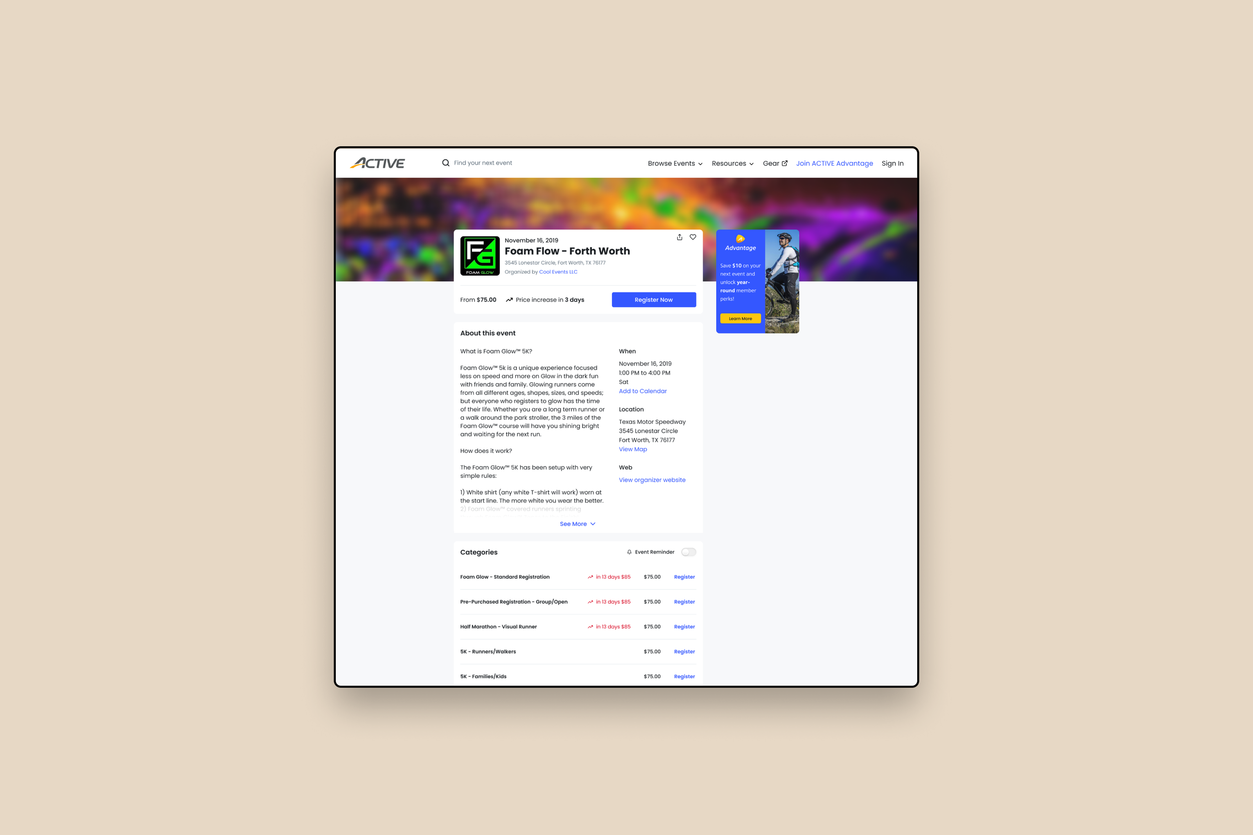
The final design brought key event details and calls-to-action to the forefront while reintroducing membership benefits as a subtle, in-flow upsell. The layout was simplified with modular content blocks, improved spacing, and consistent UI patterns—making the page easier to scan and more trustworthy. This redesign struck the right balance between business goals and user needs, leading to increased registrations, stronger engagement, and renewed visibility for ACTIVE Advantage without overwhelming the user experience.
Strategy.
Creativity.
Impact.
Strategy. Creativity. Impact.
Thanks for reading. If you’re curious to see how I approach different challenges across industries and platforms, take a look at more of my work.