Modernizing flight disruption tools for crew operations
Overview:
American Airlines’ crew tools were overwhelmed with noise—48+ alert types, unclear interfaces, and low user trust during high-stakes disruptions. Stakeholders initially pushed for quick design fixes, but I successfully made the case for user research first. By uncovering the root problems through interviews, surveys, and shadowing live ops, I reframed the solution—and led a redesign that cut alert noise by 50%, boosted clarity, and helped crews act faster with greater confidence.
Role:
Senior UX Product Designer

The Problem
Crew Watch and Crew Recovery were essential, but barely usable. Users were bombarded with 48 different alert types, cluttered screens, and navigation. It was hard to tell what needed attention and harder still to take quick, confident action.

Saying No to Just Wireframes
When I joined, stakeholders initially just wanted wireframes. “Let’s just get designs going,” they said. But I saw too many assumptions being made. I pushed back—pitching the value of doing real research first. That shift changed everything.
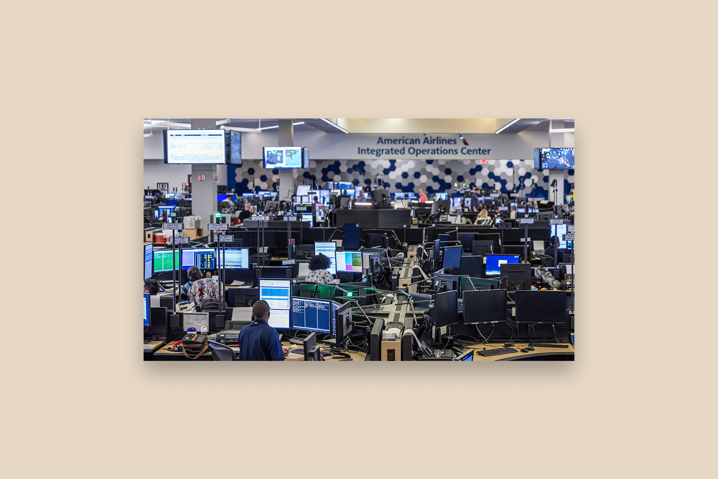
Listening in the Middle of the Storm
Instead of designing in a vacuum, I went to the heart of the operation—shadowing users during live disruption events, interviewing them in the moment, and observing how they worked under pressure. I also launched a department-wide survey that received 149 responses—a 63% response rate, far surpassing the typical 40% participation from past IOC surveys.
This combination of qualitative and quantitative research gave us a clear picture of the pain points and patterns across roles, setting the stage for more intentional design decisions.

Making the invisible visible
From research, I created the IOC’s first behavior-based personas—something the team had never seen before. These weren’t just job titles; they captured mindsets and motivations:
Trackers needed visual clarity, hierarchy, and acknowledgement of completed tasks.
Coordinators thrived on speed, flexibility, and customizable tools that could keep up.
These personas became the lens for every design decision moving forward.

Following the journey
To better understand pain points in context, I mapped the full journey for both Crew Trackers and Coordinators—revealing where their confidence dipped, frustration peaked, and critical decisions were slowed down.
For Trackers, friction appeared early:
Too many cluttered, inaccurate, or duplicate alerts made it hard to tell what was real
For Coordinators, the breakdown happened mid-journey:
Critical information—like flight cancellations or crew statuses—was often buried or missing entirely
Across both journeys, one insight stood out:
The tools didn’t match how they worked. Users needed more clarity, tighter integration, and a system that supported their actual decision-making flow—not one that made them work harder for basic information.
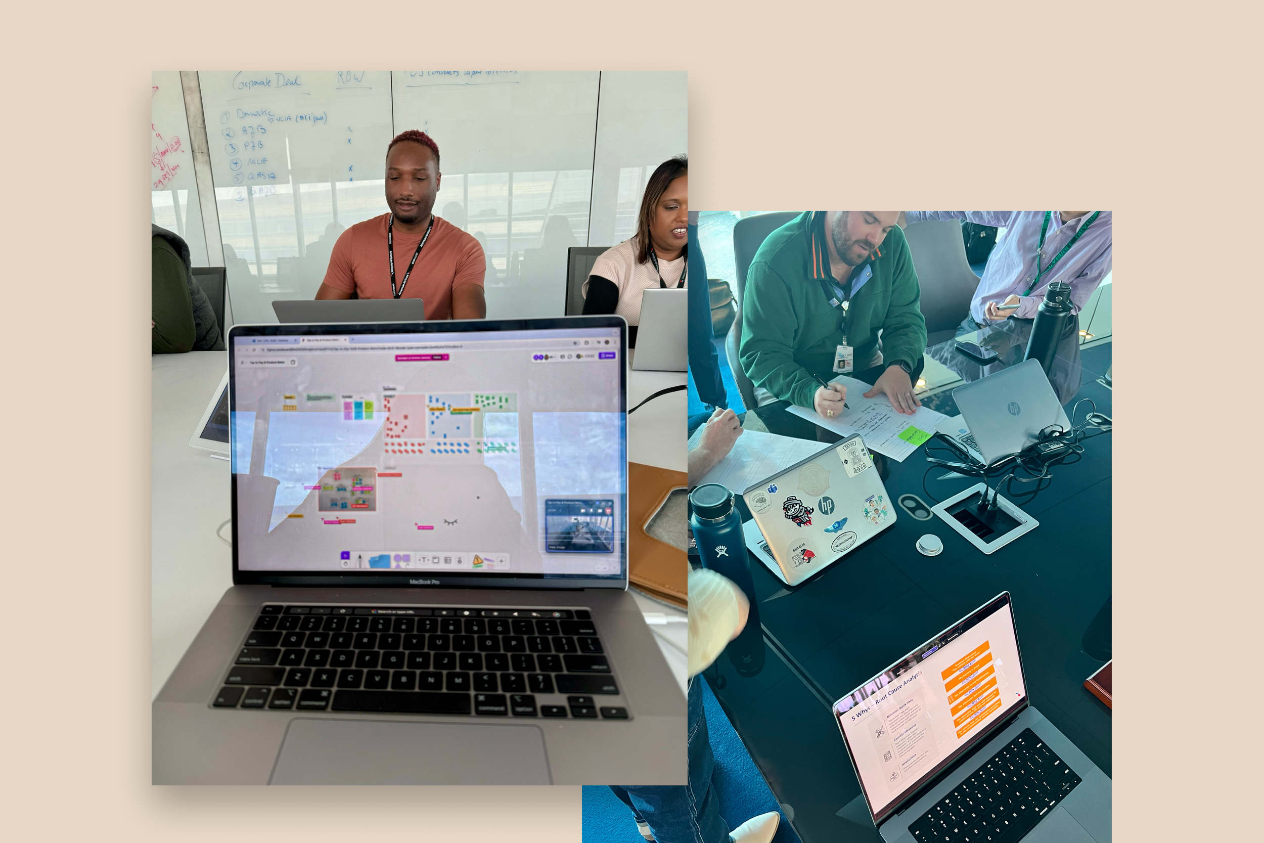
Turning insights into ideas
I facilitated design thinking sessions with stakeholders and end users to co-create solutions. After affinity clustering our research insights, we framed actionable prompts like: How might we simplify disruption workflows without sacrificing critical information?
Through sketching exercises, the team imagined ways to improve hierarchy, flow, customization, and functionality. Dot voting helped us prioritize top ideas to take into design.
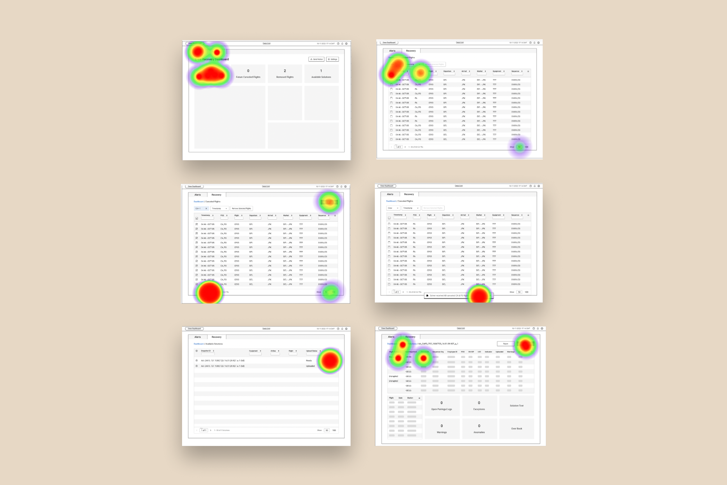
Testing with lo-fi, learning fast
I ran unmoderated low-fidelity usability tests to validate early ideas. 100% task success. Users completed workflows quickly and confidently.
Feedback included:
“I like not having too much information on the screen to run crew recovery. I just want the flights and allow me to select the flights.”
“The new proposed process seems more simple and to the point.”
“The overall experience was not complicated. Being able to see the disrupted crews is a positive.”
Hi-Fidelity
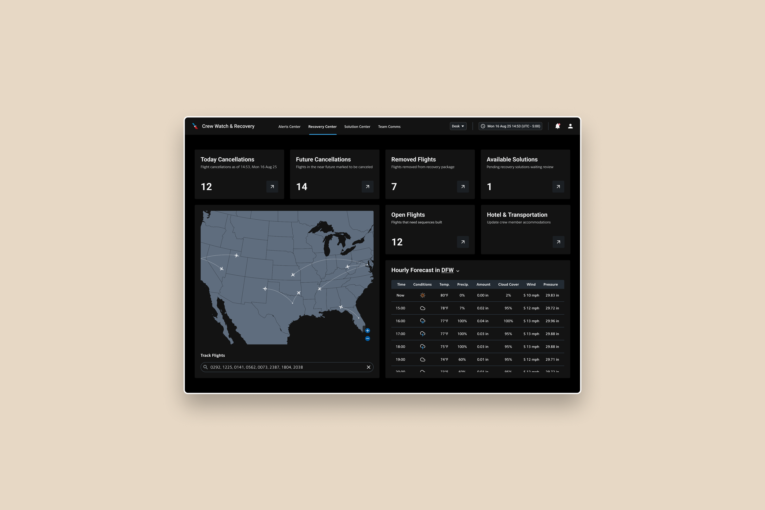
Cutting through the noise
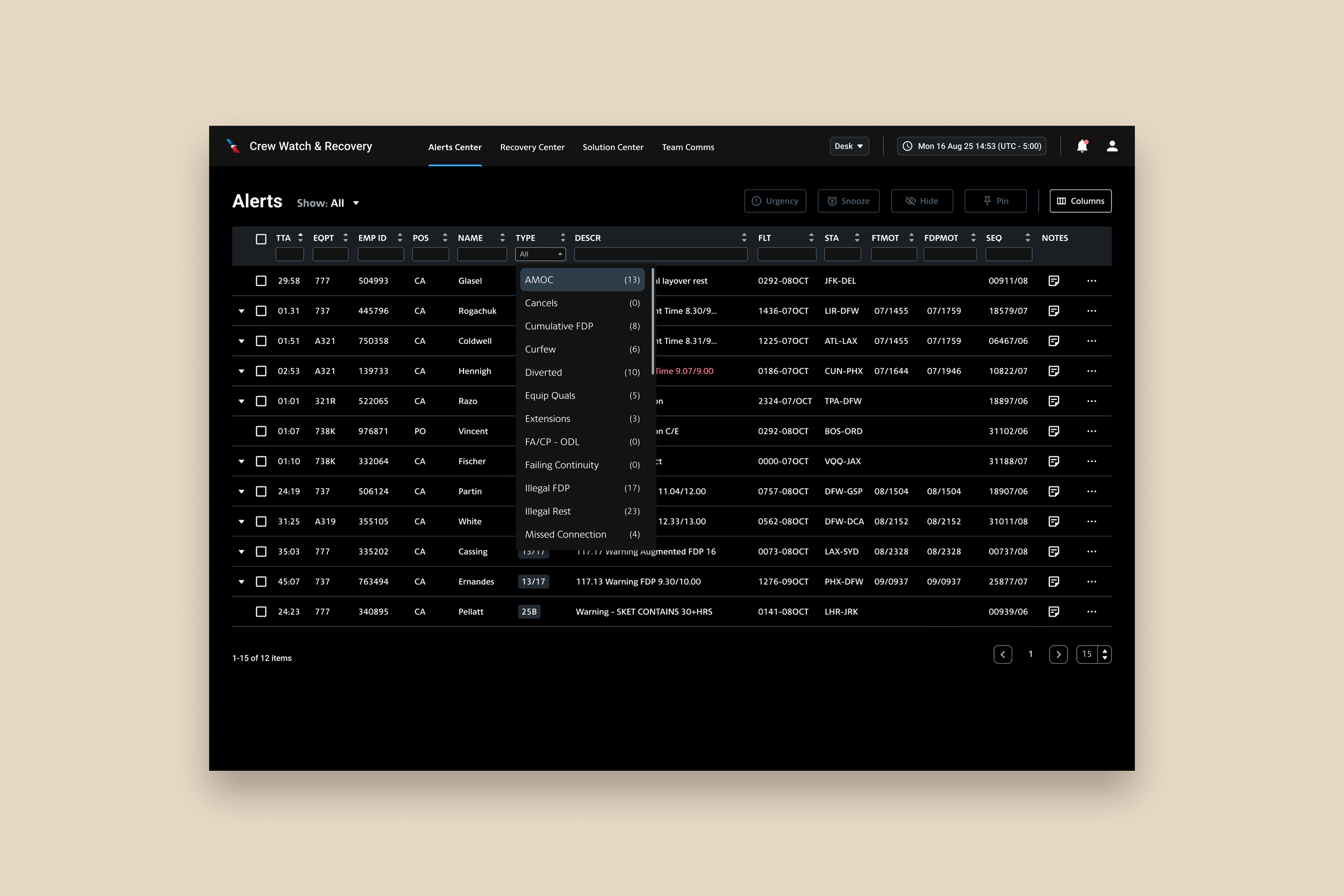
We reduced the number of alert groups from 48 to 23, helping users instantly understand what needed their attention. The redesign grouped alerts more logically, streamlined how they were displayed, and removed repetitive distractions.
Hi-Fidelity
Giving control back to users
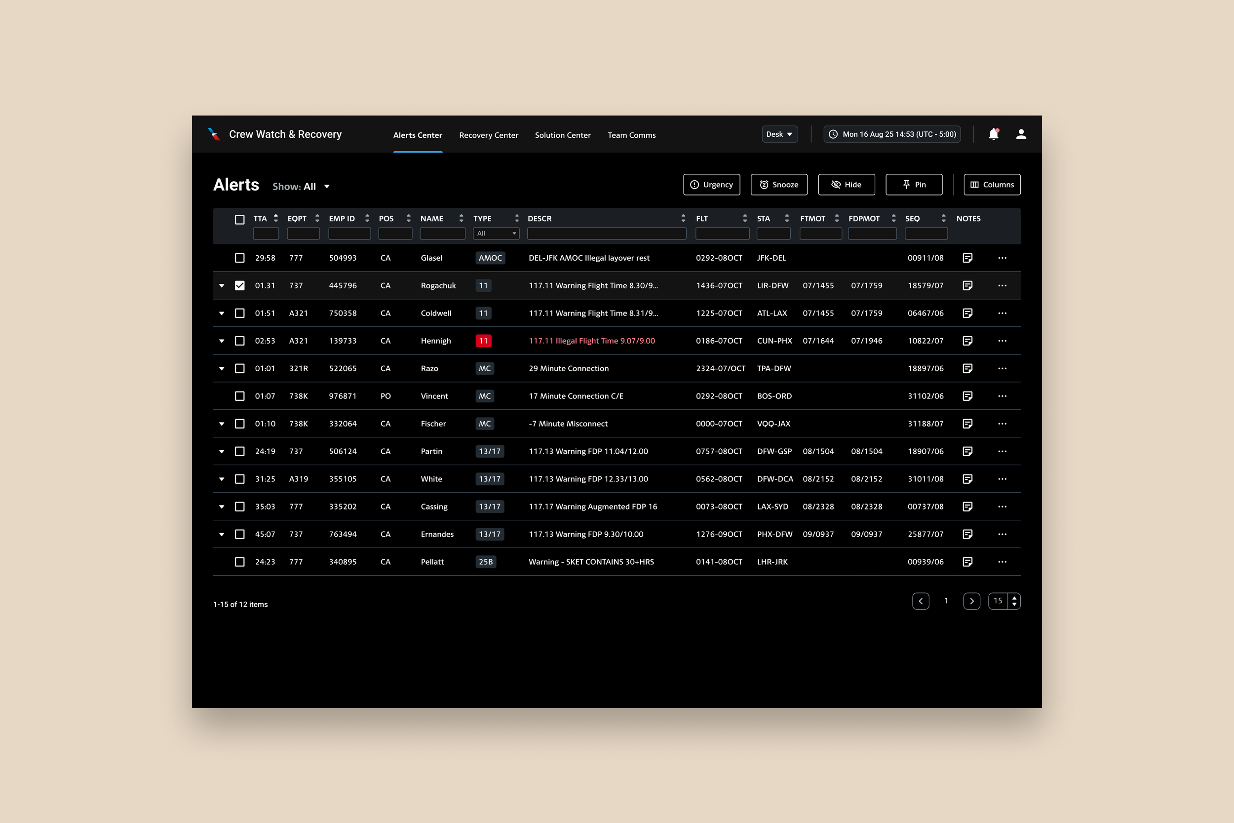
The new design introduced customizable views and filters—so users could focus on what mattered most to them. Whether they needed to zero in on one flight or monitor an entire region, the tool adapted to their style of work.
Hi-Fidelity
Designing for clarity under pressure

We removed unnecessary clutter, improved navigation, and restructured the layout to better support rapid decision-making. Icons, labels, and flows were reworked for immediate comprehension—because hesitation during a disruption isn’t an option.
Hi-Fidelity
More than usable—trustworthy

Disruption tools aren’t flashy—but they’re critical. These updates helped users cut through the noise and focus on keeping flights moving and crews in place. In a high-pressure environment like the IOC, every second counts. And the most surprising outcome? The same stakeholders who originally asked for wireframes became champions of user research, using this user centric approach as a model for future projects.
Strategy.
Creativity.
Impact.
Strategy. Creativity. Impact.
Thanks for reading. If you’re curious to see how I approach different challenges across industries and platforms, take a look at more of my work.