
Helping officers find off-duty work faster and with confidence
Overview:
RollKall’s mobile app connects law enforcement officers with off-duty job opportunities—but finding relevant shifts was frustrating. The job feed was cluttered, filters didn’t work well, and critical details were buried. While stakeholders initially pushed to shrink job cards to fit more listings, I successfully made the case for user research first. Surveys, interviews, and journey mapping revealed deeper usability issues, leading to a redesign with smarter filters, quick-apply actions, and clearer job details. Usability testing showed an 89% task success rate, and post-launch, the iOS app rose to a 4.3 rating—despite broader frustrations around payouts and job assignments outside the product itself.
Role:
Senior UX UI Designer

Lost in the Listings
Off-duty officers struggled to find relevant jobs—hunting through a sea of listings without meaningful filters or clear details. The result? Frustration, wasted time, and missed income opportunities.
Challenging Assumptions to Spark Change
The initial assumption was “let’s make the job cards smaller to show more listings in a single view.” But I convinced leadership to dig deeper first—running surveys and interviews to uncover the real problem. That shift set the direction for an entire redesign.

What Officers Really Needed
By combining qualitative interviews with survey data, I uncovered three core pain points:
Officers wanted effective filters—not more listings in a single view—to get to jobs relevant to them
Navigation was confusing, making refined searches hard to perform
The lack of a quick-apply feature meant unnecessary friction and lost interest

Two Types of Officers, One Shared Frustration
Through reach, I identified two main personas:
Veteran Officers: scheduling off-duty work to supplement their income
Junior Officers: relying on off-duty shifts for financial stability
Each group shared the same frustrations—so the solution needed to serve both with simplicity and adaptability.

Mapping the Moments That Break Trust
Mapping officers’ current flow revealed where they hit friction:
Scrolling through irrelevant listings
Confusion about job details and requirements
Uncertainty during the application process due to missing information
This journey highlighted our target areas: filtering, clarity, and seamless application.

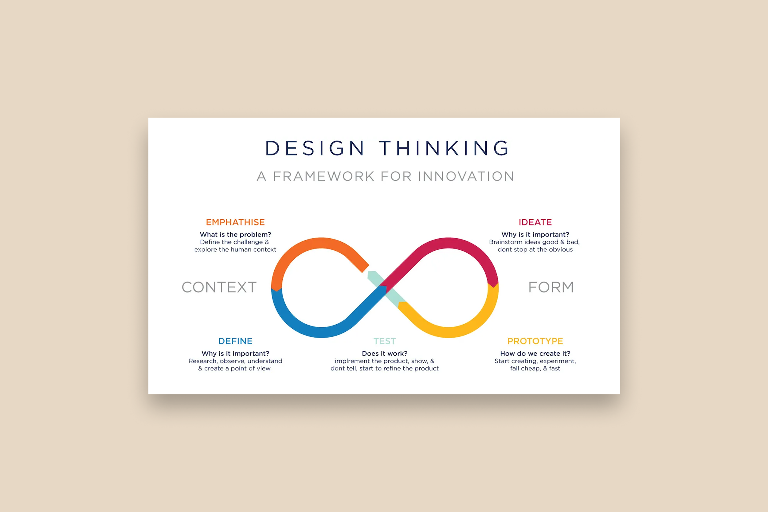
From Misalignment to Shared Mission
To get alignment, I led a design thinking workshop with the VP of Product and stakeholders. We translated user insights into opportunity areas—shifting the conversation from "how do we show more jobs?" to "how do we help officers find and apply to the right ones with ease?"
That alignment led us to a shared, focused goal:
How might we help officers find and apply to relevant off-duty jobs quickly and confidently?

Designing with Purpose
I kicked off with low-fidelity sketches focusing on:
Advanced filtering options: job type, location, pay
Clear job detail layouts with essential information upfront
Quick-apply buttons for streamlined action
I demoed these wireframes in our monthly officer review group, which I co-led with the VP of Product. This early feedback loop helped us refine ideas before moving into hi-fi designs.

What Success Looked Like
Usability testing of high-fidelity prototypes showed:
89% success rate in finding and applying for a job
Remaining failures (11%) occurred in the list/map toggle—so I added clear labels to fix that
Hi-Fidelity
Filtering that works for real life
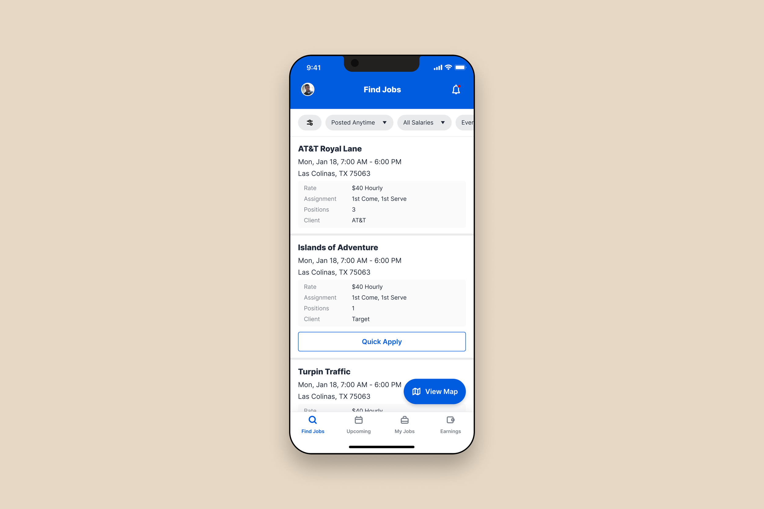
Officers can now narrow job listings based on what actually matters—location, pay, agency, and shift type. These filters are persistent, easy to adjust, and optimized for mobile use in the field. Each job card were also redesigned to surface key details at a glance—shift time, agency, location, pay, and open spots. No more tapping into every listing just to see if it’s worth applying. A prominent, clearly labeled quick-apply button was added to job listings that qualified. Officers no longer need to jump through multiple screens just to express interest in a shift.
Hi-Fidelity
Smarter navigation between views
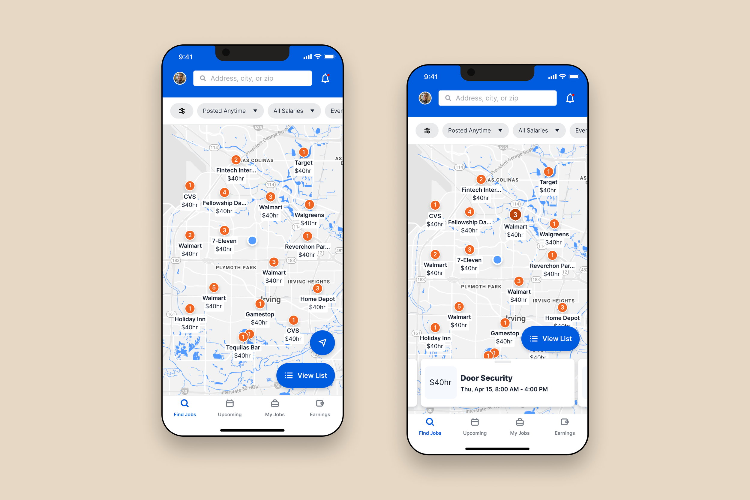
The toggle between map and list view was a major point of confusion in usability testing. I clarified the behavior by adding labels to the icons—making it easier to switch between formats without getting lost.
Hi-Fidelity
Apply in seconds

Applying for jobs is now quick and seamless. Tapping a job card opens a full-screen modal with detailed information—officers can review shift details, view all available positions, and apply to one or multiple roles with a few taps. The modal can be swiped down at any point, returning them to their exact place in the job list. This makes it effortless to jump in and out of job details, apply, and continue browsing without losing momentum.
Hi-Fidelity
No more payout confusion
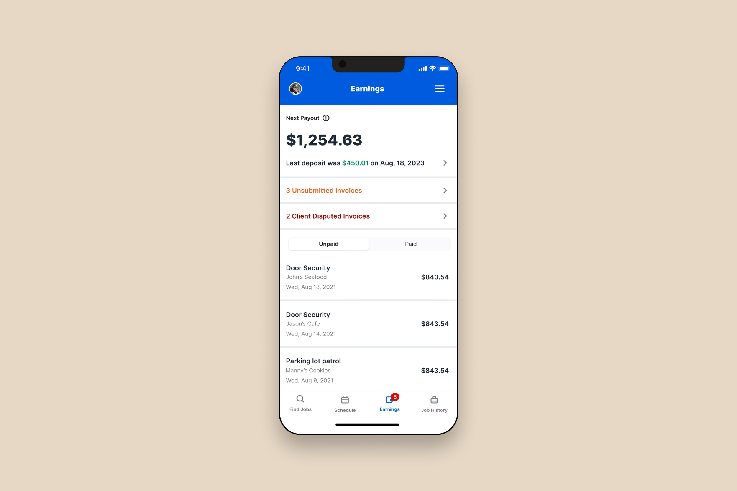
I reworked the payout display to show when and how officers get paid. Officers can now see their next payout amount and date, view any disputed invoices or submissions still needed, and easily track which invoices have been paid versus those still pending—reducing uncertainty and follow-up calls.
Strategy.
Creativity.
Impact.
Strategy. Creativity. Impact.
Thanks for reading. If you’re curious to see how I approach different challenges across industries and platforms, take a look at more of my work.